OVERVIEW
I first approached my portfolio by constructing an idea of what it would look like in my head. I knew
I wanted to stick to the dark mode theme since it was something new I hadn't tried. The overall steps
I took were:
Creating a navigation bar with a "work" and "about" section, including my name in the top left corner
Working on the landing page: editing the description to fit my personality
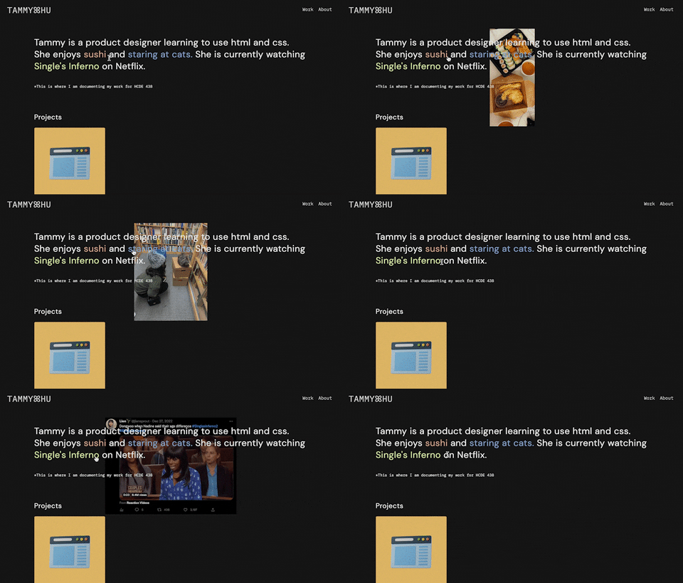
- Creating a css hover interaction on the highlighted words that displayed images on hover
Putting in a bio under "about"
Rearranging the front page to have a "projects" section, on top of an "extras" section
- Including a cheatsheets page of helpful code under "extras"
- Adding titles under the picture containers
Changing all default fonts to custom fonts of IBM Plex Mono and DM Sans
Putting in content on each page, and making sure everything was aligned correctly/organized legibly
(A mid-process photo shown below)
ISSUE(S)
I ran into a lot of issues in this process, including making this page - I struggled with figuring out how
to indent lists, change line height of a list so it didn't look weird, adjusting the width of the text box,
and adding an image that was scaled down but was aligned with the text.
One of the more notable issues I ran
into was creating the navigation bar. I didn't know where to start, so I went on the internet looking for code
I could utilize. But even when I copied in the code, my navigation bar didn't look right - the words were all
the wrong color and spacing. I did some research and figured out that the words on my nav bar were part of a list,
in which I could adjust the margins.
Editing the colors and fonts, I realized, were also done in a separate
css element. On hover, the images would also overlap on top of the nav bar, a pretty big aesthetic issue.
I resolved this by adding z-index = 0 as a property of the nav bar.
CSS TRANSITION
The CSS transition I implemented was on my landing page: a hover effect on the highlighted words of
my short intro. Essentially, I aimed to have a transition where if the cursor hovered over the words
"sushi", "staring at cats", and "Single's Inferno", it would display a relevant image behind the words.
I chose this CSS transition because I wanted to create a fun visual interaction as the first thing a
visitor on the site can play around with. I felt that it could show more personality than a plain description
of myself.
How I made it work:
Selected a color palette for the words I wanted to have a hover effect
and added this individually to the html
Created a new div class titled "hover-title", with the words
nested inside. Created another div class called "hover-image" with the img link
In the css file, I had the default hover-image to be hidden (visibility:hidden), so that when not hovered,
the user can't see the image yet. I set a condition that when the hover-title is hovered,
the hover-image because visible (visibility:visible)
Under the properties of hover-image, I adjusted the position to be fixed, slightly
offset from the hovered text, and appearing below the text. I had to consult the internet
here for some help on specific syntax I should be using
Scaled down the images to be consistent across the board
IDEAS & FUTURE
These are some additional ideas for the site in the future:
Creating a hover interaction for project images
Adding pill bottle tags for the projects as short phrase descriptions
Adding a CSS transition for my top left logo, or some kind of animation
Customizing my about page further
